

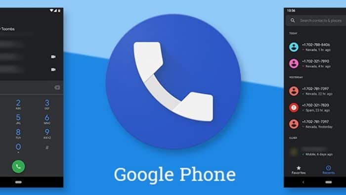
After launching the latest Android 16 operating system, the developers of the Mountain View company Google are gearing up to make a major design overhaul in line with the Material 3 Expressive design language. The company is not updating the new design to all the applications but the new design is getting implemented on its core apps gradually. The company has recently updated the design language of the default Google Phone app and it is really cool.

The latest version of the Google Phone app becomes simple and it is now more streamlined. The overcrowded bottom bar is now showing only the the “Home”, “Keypad” and “Voicemail”. The filters including missed calls, contacts and spam have been moved to the Home tab of the application.
Speaking about the Home tab, it is sharing the space with the Favorite contacts and it also shows the recent call logs. Moreover, the application will showcase calls from the same contact separately.

The “Contacts” tab is gone altogether, and the “Keypad” tab takes the middle and the developers have replaced the floating action button. The dialer of the application will not follow you around when switching between tabs.
Google is also testing a new swipe gesture for answering and rejecting calls and that is meant to reduce accidental answers or rejects while taking the device out from the pocket. The application is currently available in the beta version and the beta testers can enjoy the new changes.
Read interesting news, reviews as well as tips & tricks on TechnoBugg website, and stay updated with the latest happenings of the tech world on the go with Technobugg App. Also follow on Google News and join our Telegram channel as well as WhatsApp Channel for the latest updates.


